
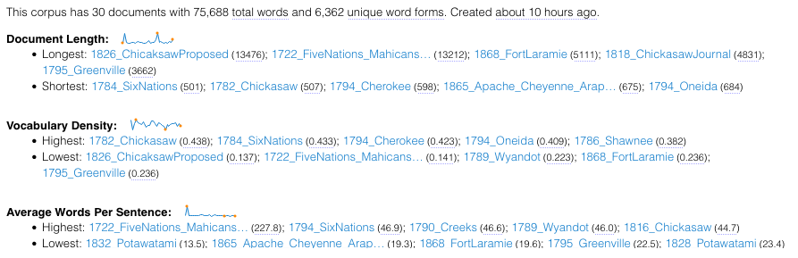
Our two Voyant visualizations are the result of ingesting the .txt files from 30 full-text treaties between the United States and various Indigenous nations in the 18th and 19th centuries. The first visualization is called Loom and graphs the instances of 500 of the most common words present across the text. Though visually engaging and dynamic when you start to drag your cursor across the left-hand list of words, this visualization does not provide enough information about the documents at first glance. If you play around with the settings and lower the word count, then you begin to see interesting word occurrences throughout the available menu categories.
The second visualization, Dreamscape, is an experimental tool from Voyant that highlights geographic text in your files and maps it; here we begin to see a pattern emerge. All of the locations highlighted are in the eastern region of the land in question. Closer reading of the text reveals that many of the later treaties involve areas further west so, though this image is very dynamic, it is just the first step of many required to begin a large-scale, investigative digital humanities project.
Voyant offered us a useful way to begin looking more closely at the text. Through distance reading, we were able to pull out what kinds of information we wanted to look for in the next phases of our analysis: geographical maps and network analysis.
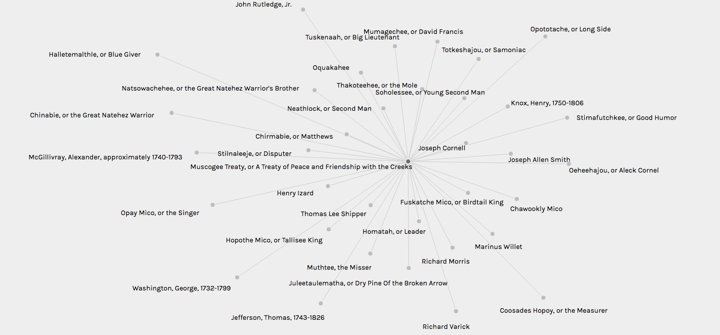
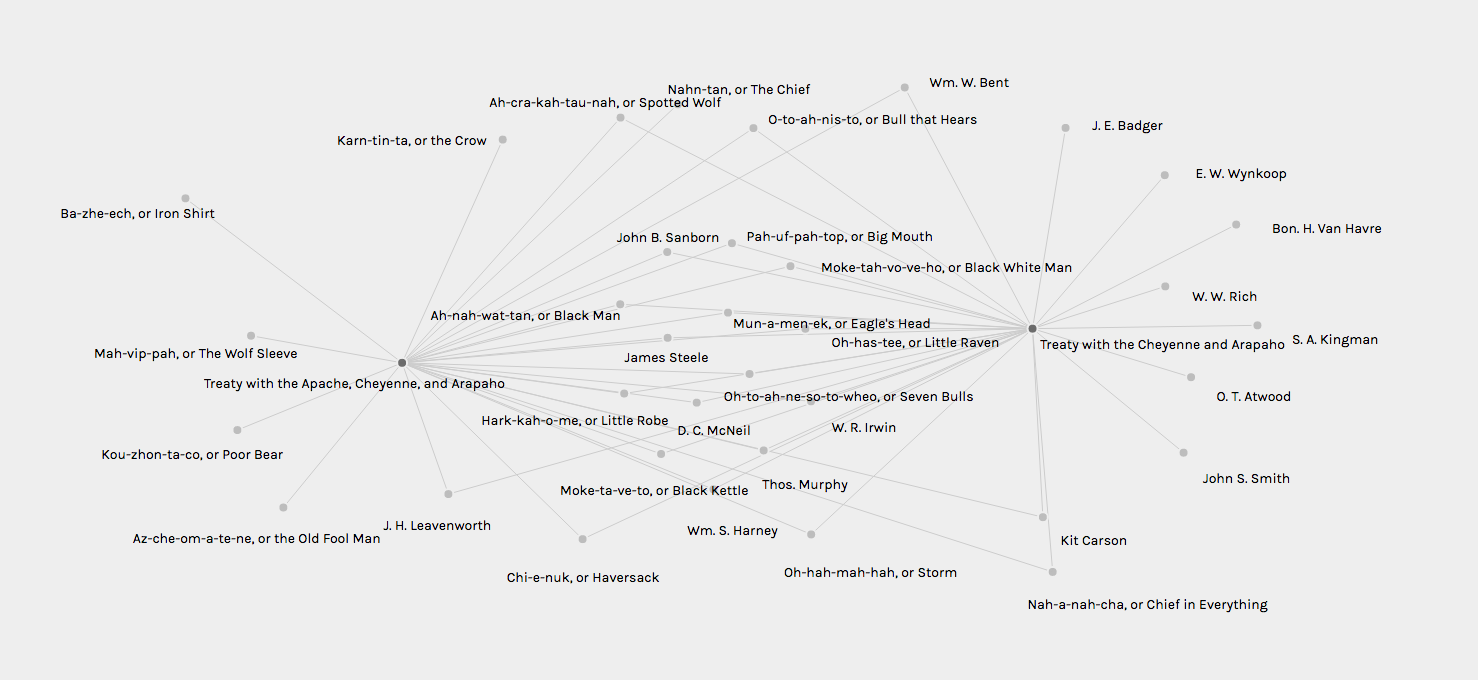
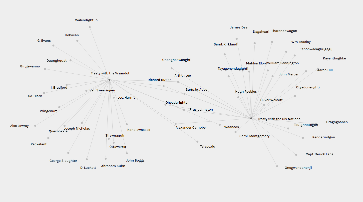
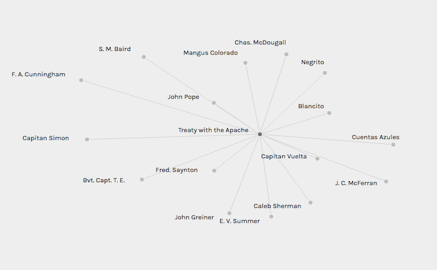
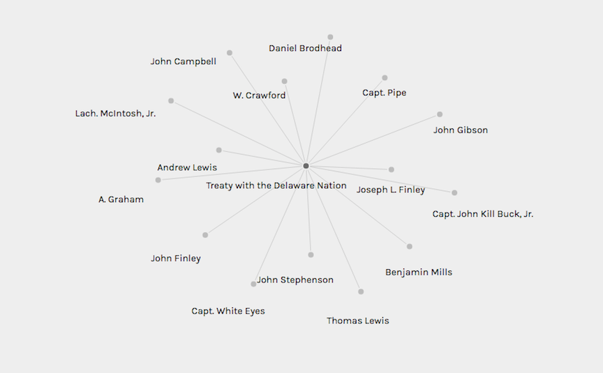
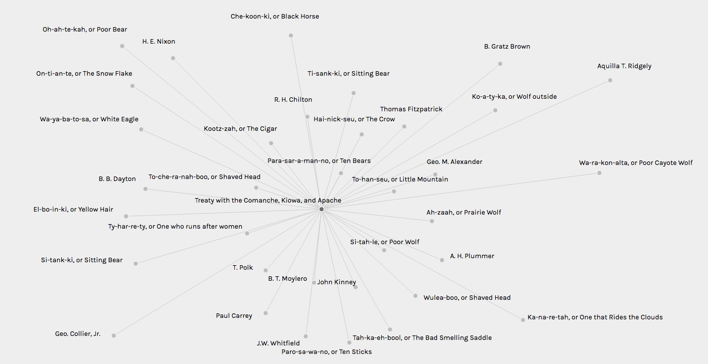
To understand whether or not the treaties within our sample data set were connected, we elected to design a data model well-suited for network visualization. The images to the right of this description and below are all screenshots of our data visualized in Palladio. Of the seven treaties analyzed through this web-based software, four of them had connections with one another.
The two treaties from 1865 (Treaty with the Apache, Cheyenne and Arapaho, Treaty with the Cheyenne and Arapaho) have a total of 20 common signatories. This isn't much of a surprise as two of the three tribes across the two documents are the same, so there was a high-likelihood that we'd find connections between them from the outset. Somewhat more surprisingly, the Treaty with the Wyandot (1785) and the Treaty with the Six Nations (1784) have five signatories in common. Each of the common signatories belongs to a representative of the United States government. This means that elected officials and government employees of the era commonly worked with multiple tribes and Indigenous nations to construct treaty documents and redefine where the United States as a geographic mass began and ended.
Future instantiations of this project would benefit from a broader data set. Imagine what connections might exist if we were able to build a network analysis of 200 or 300 treaties? What would that reveal about the relationships and rights present within them?
Even further, how could these networks be visualized if we paired this information with the accompanying geocoordinates where each treaty was signed? Would we learn new things about how these treaties impacted cartography or how cartography impacted the treaties?
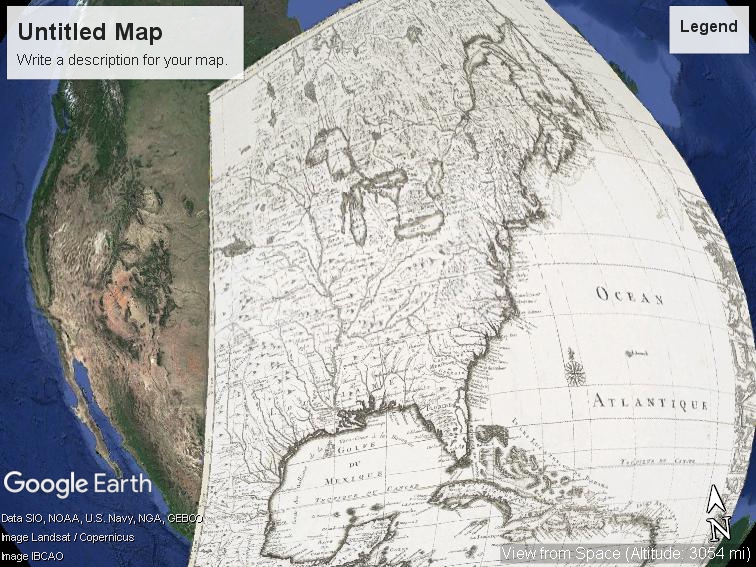
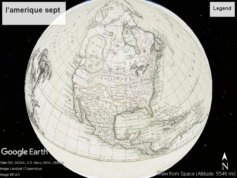
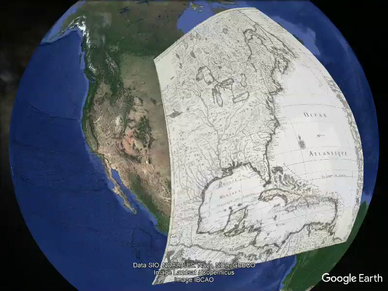
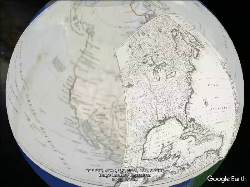
Using New York Public Library's Map Warper interface, historic maps were "rectified" with current geo-spatial data. These rectified maps were then exported into a shared Google Earth Pro folder. Transparency sliders allow users to seamlessly alternate between visual representations of the "same" physical space. How did the shape and character of the land evolve over time in these representations? How does the edge of the map effect the way we perceive space?
These images document the working prototype for this visualization. Due to limitations in Google Earth interoperability, these visualizations are currently inaccessible through the web.

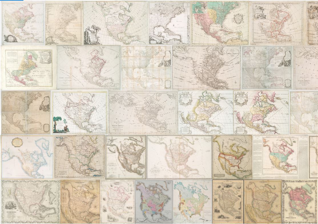
These visualizations employ computer vision and digital image analysis techniques to analyze our collection of maps. Building off of work by Lev Manovich and the Cultural Analytics Lab, we investigate how digital tools may help us explore patterns in a visual collection. Manovich defines Cultural Analytics as "the analysis of massive cultural data sets and flows using computational and visualization techniques," and while our data sets are not quite "massive," this experiment demonstrates the viability of applying visual analysis to a set of map images.
Using a suite of open source software tools developed by the Cultural Analytics Lab, we were able to analyze visual qualities (hue, saturation, brightness, shape, and size) of our map images en mass. When combined with our already rich metadata on these digital objects, this new data allowed us to create original visualizations to explore the visual qualities of the collection.
The small size and scope of our image collection severely limits the analytic value of these tools, but with the hundreds of thousands of historic cartographic images freely available through the web, we believe these techniques could be meaningfully applied to similar image collections of much larger scale. Moreover, by integrating geolocation data into the image metadata, these tools could offer new pathways into understanding the way space and geography have been depicted over time. As computer vision continues to improve identifying features such as shape, line patterns and even text, these new capabilities could be meaningfully applied as well.
These visualizations pose the following questions: what can quantitative analysis of visual qualities like color, hue, saturation and shape tell us about mapping, and how can we meaningfully analyze massive collections of historic maps using digital tools? Finally, we must recognize that because these images are "digital surrogates" of the original paper maps, discrepancies in digitization standards could greatly effect results. For this collection, all digital images share the same source (NYPL Digital Collections) and digitization standards.
____________________________________________________________________
